You’ve been blogging for a while but you’re not seeing the growth you crave.
Traffic is starting to grow, but you’re not able to convert those visitors to regular readers (yet.)
You know the importance of building an email list, but your conversion rates just aren’t where they need to be.
So, let’s fix that, shall we?
In this post I’m going to share 5 powerful conversion hacks that will help you convert those one off visitors into regular readers. Your blog will grow faster as a result.
Let’s get started:
1. Build targeted landing pages for your lead magnets
What is a landing page exactly? A landing page can technically be any page on your website that someone lands upon.
But, what I’m talking about are conversion-focused landing pages. This type of landing page stands apart from every other page on your blog.
It has no navigation. No distractions.
It’s a single page with a single conversion goal. In this case, to sign up and download your lead magnet.
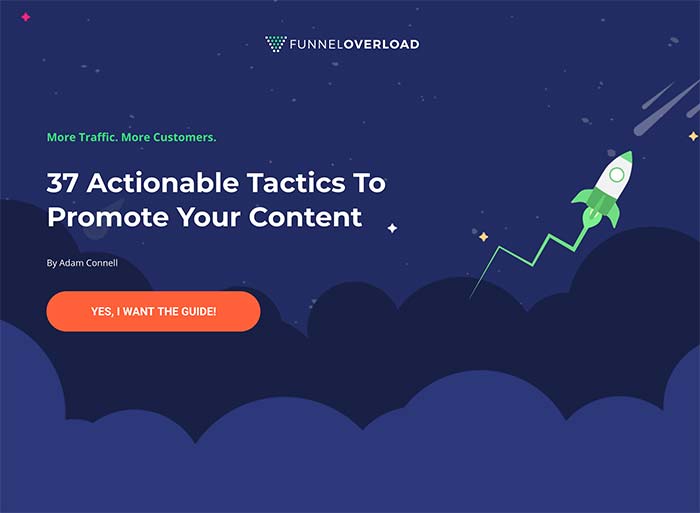
Here’s an example that I created for FunnelOverload.com:

So, why should you bother with a landing page when you probably have opt-in forms on your blog already?
Landing pages convert better than any other type of opt-in forms. By a significant amount.
The example above hasn’t been split tested and was built in a rush for a new website. And it converts at over 30%. Crazy right?!
And one of the great things is that you can get very granular with who these pages are for. You can create one for each lead magnet, or you could create one for each type of person that may want to download your lead magnet (or, each audience persona.)
Now, how exactly are you meant to create one of these landing pages?
If you use WordPress, this is really easy because there are a bunch of cost-effective landing page plugins available.
Alternatively, you could use a stand-alone landing page tool to build your pages, but these are usually a lot more costly.
Once you’ve built your landing page, you can start off promoting it by doing the following:
- Add a link to your social media profiles
- Share a link on your social networks
- Add a link to your navigation bar
- Create unique Pinterest graphics to promote your landing page
But, by far the most effective use of conversion-focused landing pages is to use them as part of a sales funnel together with paid traffic.
2. Offer category targeted lead magnets
Lead magnets are a great way to get more people on your email list. But can you take them a step further?
Yes, you can!
You may have heard of something called the content upgrade technique. These are just post-specific lead magnets). But, this isn’t what I’m talking about here.
You won’t need to create incentives for each one of your blog posts. Wow, that’s a lot of work!
Instead, I’m talking about creating lead magnets for each of the main topics you talk about on your blog. In your content management system (e.g. WordPress), they can be arranged by category.
Here’s the big question: What sort of results can you expect?
It depends on a lot of variables. Your copy, your offer, your content, and a few more things.
But, when I tried this for an agency I used to work for – the result was a 300% increase in email sign ups.
Here’s how to get started:
- Take note of up to 5 main topics you cover on your blog
- Make sure they’re organised by category
- Create a lead magnet for each topic/category (you can use PDF versions of the post, PDF’s with bonus tips, templates, or checklists)
- Create opt-in forms for each category
- Add your opt-in forms using a tool that supports category-level targeting (Thrive Leads or ConvertPro are solid options, if you use WordPress)
- Integrate your email provider
The part where this gets tricky is integrating your email provider. With some email providers, it may mean creating several different email lists.
Or, if you use the Thrive Leads plugin, you can integrate a transactional email service and it will email the lead magnets for you.
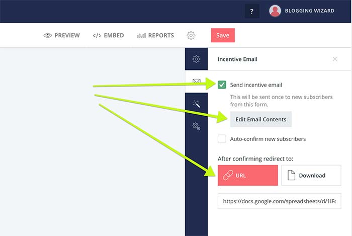
Another option is to use an email marketing service like ConvertKit because they have a unique way of handling email sign up forms. For every form you create, you can assign a lead magnet by providing a URL or file download.
You can customise the confirmation email, and once a user confirms their subscription, they get access to the download.

Sidenote: I won’t go into GDPR here since I’m not a lawyer and most lawyers would likely disagree on what’s necessary. That said, it’s important to ensure you are completely transparent about what people are signing up for. Just so we’re clear, this isn’t legal advice, okay? 😉
3. Add social proof to establish your authority
You’ve probably seen examples of social proof all over the web.
We’re talking about testimonials, trust logos, and any data that a company shares that makes it look impressive.
Here’s why these trust indicators improve conversions:
On a psychological level, we assume that if a bunch of other people are taking one course of action, that it’s the correct course of action to take.
Now, when you display powerful examples of social proof, it can help to establish you as an authority, and build your credibility. In a nutshell, it gives people more of a reason to listen to what you have to say.
And in a world where we’re all vying for the same spot-light as countless other bloggers – social proof matters.
Now, what can you do with social proof?
Whether you’re adding testimonials, or trust logos, prime places to add this social proof include:
- Homepage
- Service pages
- About page
- Opt-in forms
- Landing pages
- Sales pages
- Order pages
It’s also important to note that social proof can actually be positive or negative. Display something noteworthy and you’ll create a positive sense of social proof.
When it comes to negative social proof, it’s typically an issue when displaying numbers. For example, if you have social media widgets that tell people you have 10 followers, what you’re actually saying to them is “hardly anyone followers me and you probably shouldn’t either.”
4. Use contrasting colors for your calls to action
If you want any of your readers to complete a specific action, you’ll need to display a call to action. Otherwise known as a CTA.
This will typically come in the form of button. Whether it’s attached to an opt-in form, part of some sort of call out box, or on it’s own.
The only problem with most buttons is they don’t stand out. This is because there’s no contrast between other colors in the design.
So, if your blog uses a lot of blue in it’s design – don’t use blue for buttons. Use something with more contrast such as red or orange. In my brand color guidelines I like to refer to this as the “action color.”
Here’s an example:

While this example isn’t from a blog, this page from 20i.com illustrates my point perfectly. Notice how the green buttons contrast the rest of the design?
If you’re not sure what color buttons would still match the rest of your design, while standing out, consider grabbing the hex code for one of the colors from your design.
Then type it into a free tool called Paletton.
You can then use that tool to find a number of colors that you can use.
5. Split-test your opt-in forms & landing pages for maximum conversions
The web is full of best practice advice that will help you improve conversions.
But, it’s important to understand that best practice isn’t always right. It plays on the law of averages.
Think of it like the foundation to a house. Every house needs a foundation, but there’s a lot of building to do afterwards.
So, when focusing on improving conversions for any element of your blog, use best practice as your starting point. Then run tests to further improve your conversions.
WordPress plugins like Thrive Leads and ConvertPro will take care of this for your opt-in forms. And some landing page builders have this functionality built-in (Leadpages and Unbounce are great examples.)
But, if you want to split-test your landing pages and don’t have the functionality built-in, you can always use Google Optimize – there’s a bit of technical setup to deal with but you can get started for free.
Wrapping it up
Growing a successful blog is a marathon. Not a sprint.
Regardless of what stage you’re at, these ideas will help you move those conversions in the right direction.
Now, it’s time to take action. There’s no better time than now.
About the author:

Adam Connell is a content strategist with a background in SEO and email marketing. He used to manage the content marketing efforts of international brands. Now he teaches bloggers how to get noticed at BloggingWizard.com


0 Comments